Sign inGet Pro
IntrosBentosShotsMCPPricing
Sign inGet Pro
IntrosBentosShotsMCPPricing
Sign inGet Pro
IntrosBentosShotsMCPPricing

The curated reference library
for brand designers. Made by Sahkyo.

Rebrand on XRebrand on InstagramRebrand on ThreadsRebrand on LinkedIn

Company

About UsPricingMCP

Examples

Rebranding examplesBrand identity examples
Shots
Billboard & OOHPackagingBrand guidelinesSignageMerchEditorialStationery
Industries
FintechAIHospitalityFoodHealthcareSportsCulture
Styles
Geometric3DGradientPatternWordmark
Typography
Sans SerifSerifDisplayMono
Typefaces
ABC DiatypeRoobertRebond GrotesqueSuisse Int'lNeue Montreal
Feels
VibrantApproachableConfidentHumanWarm

© 2026 Rebrand. All rights reserved.

PrivacyTermsCopyright
Komyo 2025 brand identity by Espina
Komyo logo

Komyo

Komyo Brand Identity

Espina·Restaurant·2025

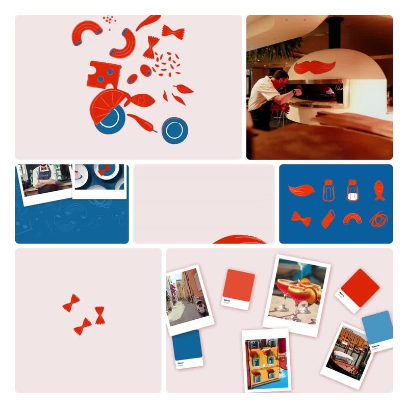
Komyo reimagines the restaurant menu as a living, adaptable tool, pairing a customizable digital platform with NFC-enabled cards and built-in analytics. It helps restaurants make guest interactions smoother while gathering the insight they need for smarter business decisions. Espina named the brand and created its 2025 identity, which aims to feel friendly and easy to use without losing polish, presenting Komyo as more than software: a voice that restaurants and their guests can trust.

Case Study
Explore
Colors

Pro

Typography

Pro

Type 1Type 2
Styles

Pro

Style 1Style 2Style 3Style 4

See this brand's 5 colors, typography and 4 styles with Rebrand Pro.

Upgrade to unlock

Shots

Komyo: Wordmark colourways, 2025 brand identity by Espina
Wordmark colourways
Wordmark
Komyo Art Direction: Food pattern on red, 2025 brand identity by Espina
Food pattern on red
Art Direction
Komyo Art Direction: Design your menu, 2025 brand identity by Espina
Design your menu
Art Direction
Komyo Art Direction: Venue types and phone, 2025 brand identity by Espina
Venue types and phone
Art Direction

See all 9 shots with Rebrand Pro.

Upgrade to unlock

Komyo among food tech companies

Pro

On the expressive, approachable sideTop third for approachability. Brand 25 is the most approachable
ExpressiveRestrainedPreciseApproachableKomyoBrand 25Brand 6Brand 3Brand 18Brand 17Brand 5Brand 15Brand 29Brand 8Brand 28Brand 10Brand 7Brand 26Brand 13Brand 12
A rare lime hereIn 2 of 30 palettes here
2018’19’20’21’22’23’24’25
Two hues in one paletteMost others use one or two hues
Rare tags hereUnder 1 in 5 others have each
  • #Witty
  • #Characters
  • #Display
  • #Geometric
  • #Playful
Closest: Brand 11 and Brand 6Furthest palette: Brand 3
Brand 111 close colourBrand 61 close colour

See where Komyo sits among 6 food tech companies with Rebrand Pro.

Upgrade to unlock

Similar vibe

Intros and bentos that look and feel like Komyo

Open in new tab
Komero 2023 brand identity by Werklig
Komero logo

Komero

Open in new tab
Odessa Market 2022 brand identity by Flov
Odessa Market logo

Odessa Market

Open in new tab
Signor Fox 2026 brand identity by Boldly
Signor Fox logo

Signor Fox

Open in new tab
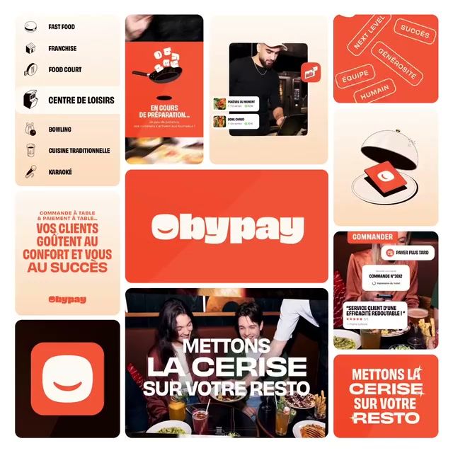
Obypay 2024 brand identity by Call Me Lord
Obypay logo

Obypay

More like this

  • More hospitality brandingIndustry
  • More by EspinaStudio
  • More illustration identitiesStyle
  • More high-contrast identitiesStyle
  • More uppercase identitiesStyle
  • More hand-drawn identitiesStyle