Sign inGet Pro
IntrosBentosShotsMCPPricing
Sign inGet Pro
IntrosBentosShotsMCPPricing
Sign inGet Pro
IntrosBentosShotsMCPPricing

The curated reference library
for brand designers. Made by Sahkyo.

Company

About UsPricingMCP

Examples

Rebranding examplesBrand identity examples
Shots
Billboard & OOHPackagingBrand guidelinesSignageMerchEditorialStationery
Industries
FintechAIHospitalityFoodHealthcareSportsCulture
Styles
Geometric3DGradientPatternWordmark
Typography
Sans SerifSerifDisplayMono
Typefaces
ABC DiatypeRoobertRebond GrotesqueSuisse Int'lNeue Montreal
Feels
VibrantApproachableConfidentHumanWarm

© 2026 Rebrand. All rights reserved.

PrivacyTermsCopyright
Itaú logo

Itaú

Itaú Rebrand & Brand Identity

Pentagram·Finance·2024

Itaú is Brazil's largest bank, based in São Paulo, and it turned 100 in 2024. Pentagram's 2024 rebrand, made with Itaú's in-house team, evolves the bank's 1970s orange square into the pedra, a stone with larger rounded corners and bowed sides, and tightens the lowercase logotype with a round dot on the i. The bank wanted to mark its centenary by drawing on heritage rather than freezing it, and to become more personal for the next hundred years.

Case Study
Explore
Assets
Download
Company
Website
Colors

Pro

Typefaces

Pro

Typeface
Typography
Styles

Pro

Style 1Style 2Style 3Style 4Style 5

See this brand's 13 colors, 1 typeface and 5 styles with Rebrand Pro.

Upgrade to unlock

Shots

Itaú: Brand Color Palette, 2024 rebrand by Pentagram
Brand Color Palette
Color Palette
Itaú: Typography & Icons, 2024 rebrand by Pentagram
Typography & Icons
Typography
Itaú: Mobile Payment Security Illustration, 2024 rebrand by Pentagram
Mobile Payment Security Illustration
Illustration
Itaú: Brand Guidelines Overview, 2024 rebrand by Pentagram
Brand Guidelines Overview
Guidelines

See all 11 shots with Rebrand Pro.

Upgrade to unlock

Itaú among banks

Pro

On the expressive, approachable sideTop third for approachability. Brand 25 is the most approachable
ExpressiveRestrainedPreciseApproachableItaúBrand 25Brand 6Brand 3Brand 18Brand 17Brand 5Brand 15Brand 29Brand 8Brand 28Brand 10Brand 7Brand 26Brand 13Brand 12
A rare lime hereIn 2 of 30 palettes here
2018’19’20’21’22’23’24’25
Two hues in one paletteMost others use one or two hues
Rare tags hereUnder 1 in 5 others have each
  • #Witty
  • #Characters
  • #Display
  • #Geometric
  • #Playful
Closest: Brand 11 and Brand 6Furthest palette: Brand 3
Brand 111 close colourBrand 61 close colour

See where Itaú sits among 6 banks with Rebrand Pro.

Upgrade to unlock

Similar vibe

Intros and bentos that look and feel like Itaú

Mastercard 2016 rebrand by Pentagram: brand identity reveal
Mastercard logo

Mastercard

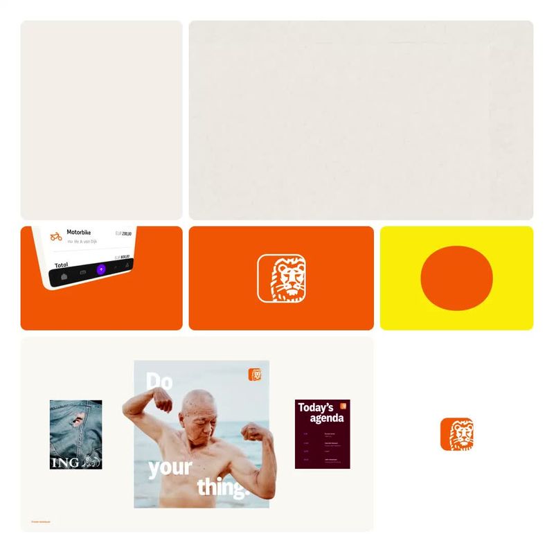
ING 2025 brand identity by AKQA
ING logo

ING

Relocatenow 2024 brand identity by Halo Lab
Relocatenow logo

Relocatenow

Mapfre 2026 rebrand by Design Bridge and Partners: brand identity reveal
Mapfre logo

Mapfre

More like this

  • More fintech brandingIndustry
  • More by PentagramStudio
  • More custom typefacesTypeface
  • More illustration identitiesStyle
  • More pattern identitiesStyle
  • More mask identitiesStyle
  • More flat identitiesStyle
  • More geometric identitiesStyle
Itaú 2024 rebrand by Pentagram: brand identity reveal
0:00 / 0:38· Intro