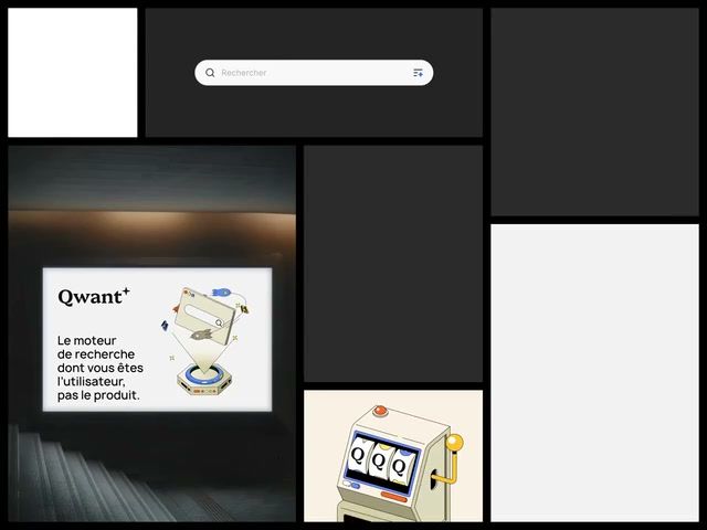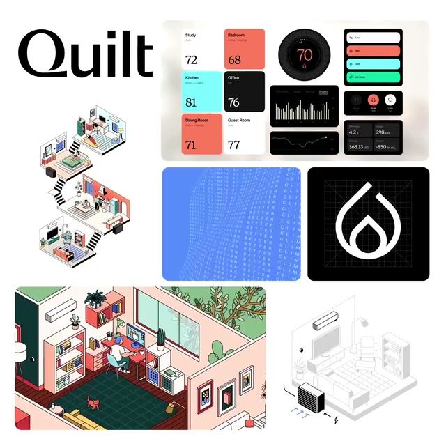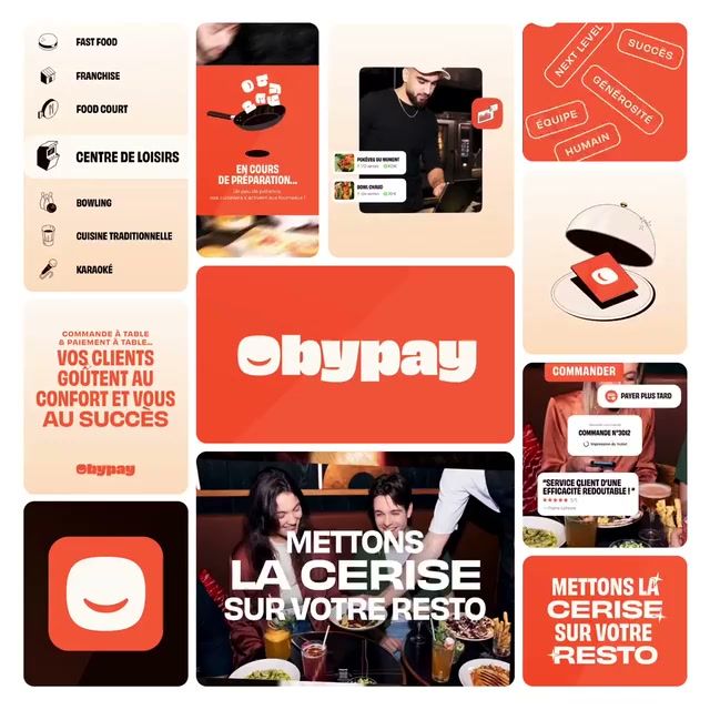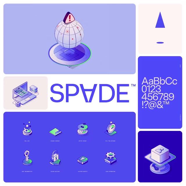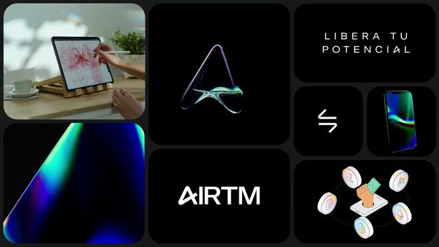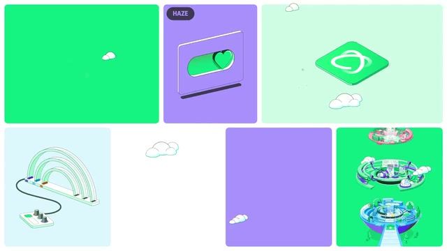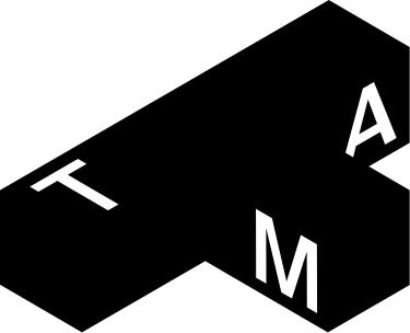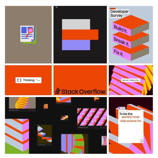

Every identity on Rebrand that takes a isometric approach — browsable by industry, color, and studio.
Pro
Isometric brands default to blue, sans serif and an approachable, technical tone, with illustration close to universal. Playful, colourful and uppercase work is rare here, so a new brand could lead with bright, playful colour and uppercase type to stand apart.
Get the full snapshot for any search with Rebrand Pro.
Upgrade to unlock