Sign inGet Pro
IntrosBentosShotsMCPPricing
Sign inGet Pro
IntrosBentosShotsMCPPricing
Sign inGet Pro
IntrosBentosShotsMCPPricing

The curated reference library
for brand designers. Made by Sahkyo.

Rebrand on XRebrand on InstagramRebrand on ThreadsRebrand on LinkedIn

Company

About UsPricingMCP

Examples

Rebranding examplesBrand identity examples
Shots
Billboard & OOHPackagingBrand guidelinesSignageMerchEditorialStationery
Industries
FintechAIHospitalityFoodHealthcareSportsCulture
Styles
Geometric3DGradientPatternWordmark
Typography
Sans SerifSerifDisplayMono
Typefaces
ABC DiatypeRoobertRebond GrotesqueSuisse Int'lNeue Montreal
Feels
VibrantApproachableConfidentHumanWarm

© 2026 Rebrand. All rights reserved.

PrivacyTermsCopyright
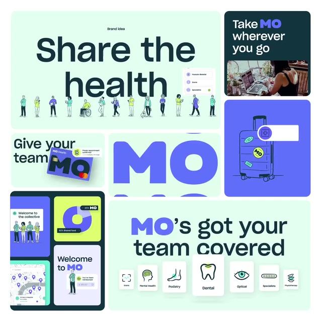
Mo 2023 brand identity by Onwards
Mo logo

Mo

Mo Brand Identity

Onwards·Health·2023

Mo, previously Mosaic, is a new collective model of health cover powered by its members, whose fees fund one another's claims, so the service gets better as more people join. It set out to counter everything people dislike about health insurance: maze-like processes, awkward providers and stressful claims. Onwards' 2023 work covered the name, strategy, visual and verbal identity, campaign and UI, putting members before premiums.

Case Study
Explore
Colors

Pro

Typography

Pro

Type
Styles

Pro

Style 1Style 2Style 3Style 4Style 5Style 6

See this brand's 6 colors, typography and 6 styles with Rebrand Pro.

Upgrade to unlock

Shots

Mo Logo Construction: Wordmark, 2023 brand identity by Onwards
Wordmark
Logo Construction
Mo Art Direction: Pattern, 2023 brand identity by Onwards
Pattern
Art Direction
Mo Art Direction: No claims bonus, 2023 brand identity by Onwards
No claims bonus
Art Direction
Art Direction: Mo people, less problems, 2023 brand identity by Onwards
Mo people, less problems
Art Direction

See all 22 shots with Rebrand Pro.

Upgrade to unlock

Mo among insurers

Pro

On the expressive, approachable sideTop third for approachability. Brand 25 is the most approachable
ExpressiveRestrainedPreciseApproachableMoBrand 25Brand 6Brand 3Brand 18Brand 17Brand 5Brand 15Brand 29Brand 8Brand 28Brand 10Brand 7Brand 26Brand 13Brand 12
A rare lime hereIn 2 of 30 palettes here
2018’19’20’21’22’23’24’25
Two hues in one paletteMost others use one or two hues
Rare tags hereUnder 1 in 5 others have each
  • #Witty
  • #Characters
  • #Display
  • #Geometric
  • #Playful
Closest: Brand 11 and Brand 6Furthest palette: Brand 3
Brand 111 close colourBrand 61 close colour

See where Mo sits among 7 insurers with Rebrand Pro.

Upgrade to unlock

Similar vibe

Intros and bentos that look and feel like Mo
Open in new tab
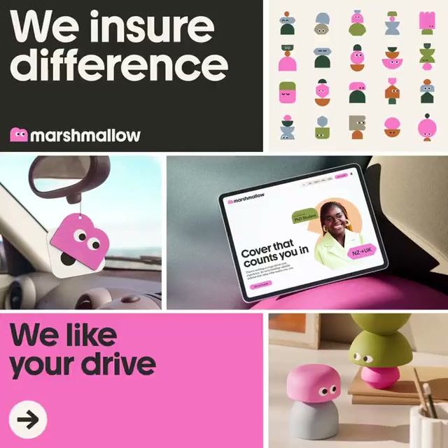
Marshmallow 2024 brand identity by Ragged Edge
Marshmallow logo

Marshmallow

Open in new tab
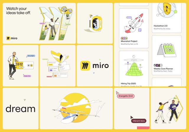
Miro 2023 brand identity by AKQA
Miro logo

Miro

Open in new tab
Howden 2023 rebrand by North: brand identity reveal
Howden logo

Howden

Open in new tab
Munu 2023 rebrand by Oker: brand identity reveal
Munu logo

Munu

More like this

  • More healthcare brandingIndustry
  • More illustration identitiesStyle
  • More UI identitiesStyle
  • More line art identitiesStyle
  • More icon set identitiesStyle
  • More characters identitiesStyle
  • More photography identitiesStyle