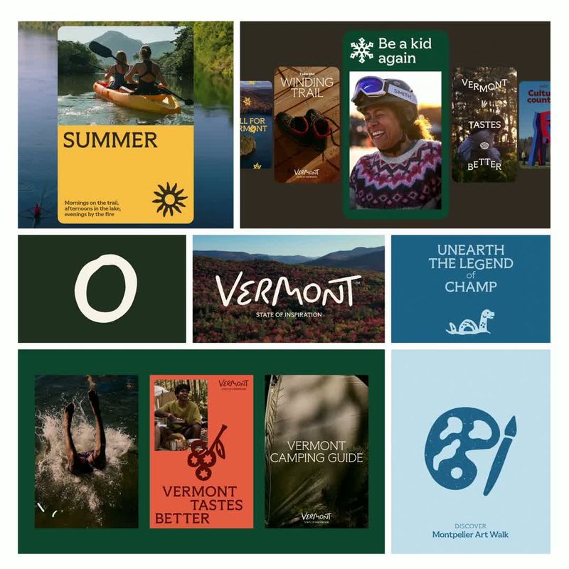

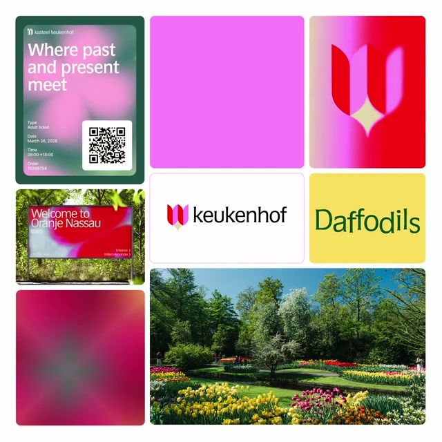
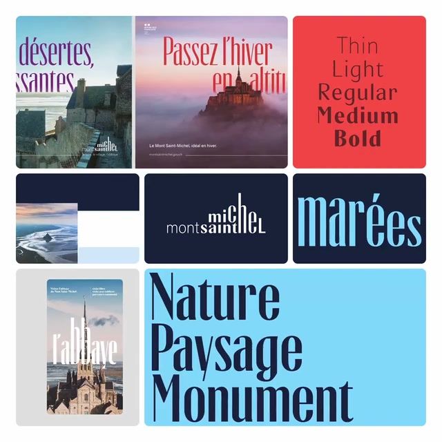
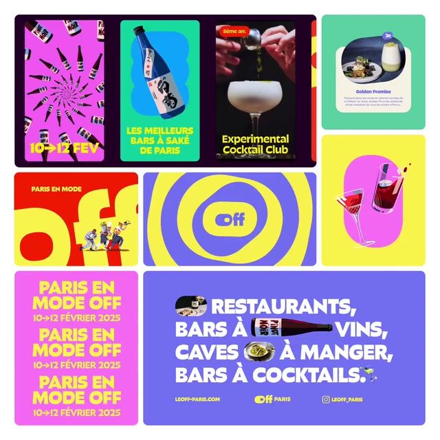
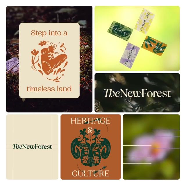
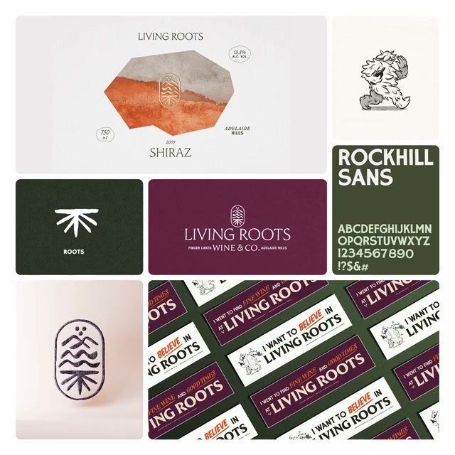
Every destinations identity in the gallery — logos, systems, and the work around them, browsable by style and studio.
Pro
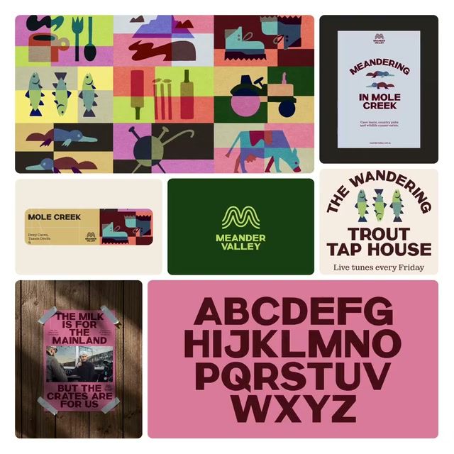
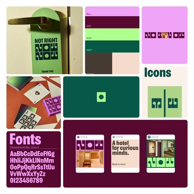
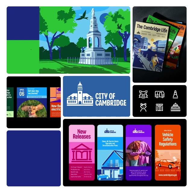
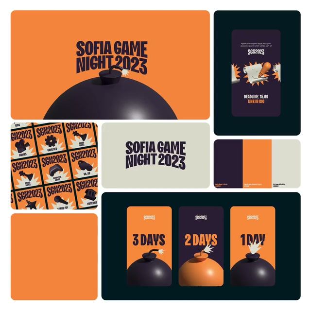
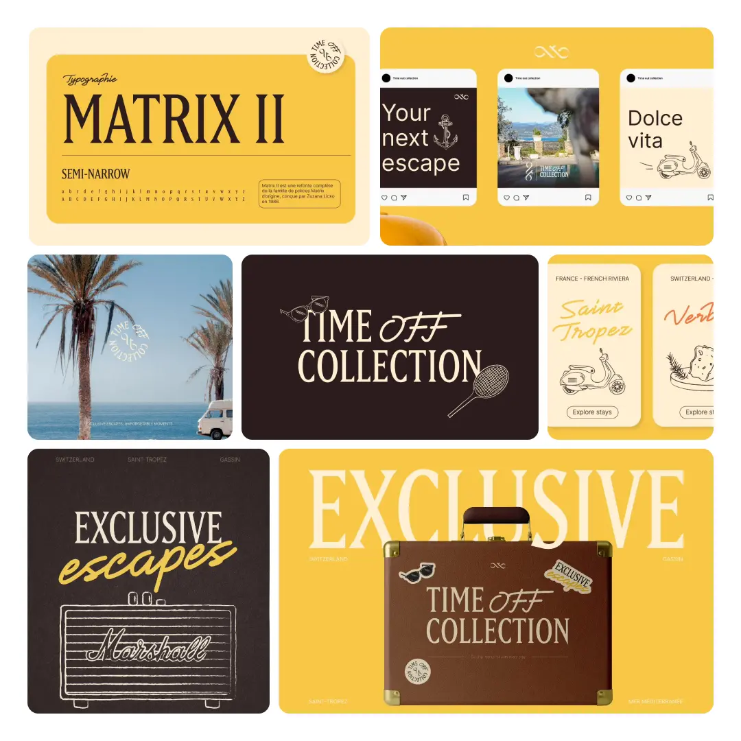
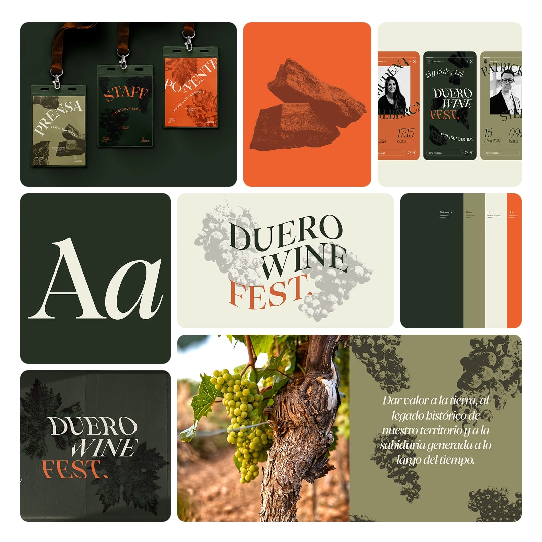
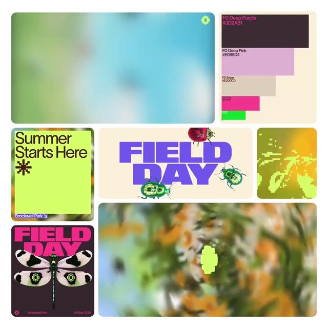
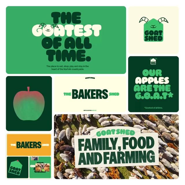
Destinations default to forest green, yellow and sans serif, with photography and illustration doing most of the work. A confident, geometric direction here is nearly unclaimed, so a brand that leads with bold, structured forms would stand apart. Newer brands are moving toward light neutrals and blues and teals, away from playful and shape-led work.
Get the full snapshot for any search with Rebrand Pro.
Upgrade to unlock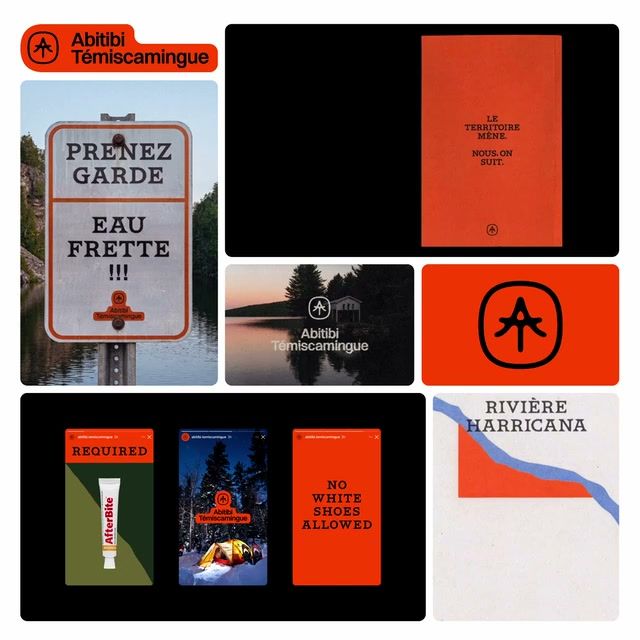
















Search and filter the library for free. Join 40,000 designers already inside.


