Sign inGet Pro
IntrosBentosShotsMCPPricing
Sign inGet Pro
IntrosBentosShotsMCPPricing
Sign inGet Pro
IntrosBentosShotsMCPPricing

The curated reference library
for brand designers. Made by Sahkyo.

Rebrand on XRebrand on InstagramRebrand on ThreadsRebrand on LinkedIn

Company

About UsPricingMCP

Examples

Rebranding examplesBrand identity examples
Shots
Billboard & OOHPackagingBrand guidelinesSignageMerchEditorialStationery
Industries
FintechAIHospitalityFoodHealthcareSportsCulture
Styles
Geometric3DGradientPatternWordmark
Typography
Sans SerifSerifDisplayMono
Typefaces
ABC DiatypeRoobertRebond GrotesqueSuisse Int'lNeue Montreal
Feels
VibrantApproachableConfidentHumanWarm

© 2026 Rebrand. All rights reserved.

PrivacyTermsCopyright
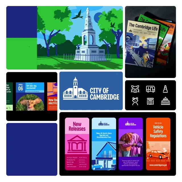
City of Cambridge 2025 brand identity by Nimblebot
City of Cambridge logo

City of Cambridge

City of Cambridge Brand Identity

Nimblebot·Destinations·2025

The City of Cambridge, Massachusetts, wanted one consistent identity to bring together communications across its departments while staying true to its values of inclusivity, diversity and innovation. Nimblebot's 2025 overhaul delivers an adaptable branding system, backed by ongoing support for publications, campaigns, digital platforms and community engagement.

Case Study
Explore
Company
Website
Colors

Pro

Typefaces

Pro

Typeface
Typography
Styles

Pro

Style 1Style 2Style 3Style 4

See this brand's 11 colors, 1 typeface and 4 styles with Rebrand Pro.

Upgrade to unlock

Shots

City of Cambridge: Seal to symbol, 2025 brand identity by Nimblebot
Seal to symbol
Symbol
City of Cambridge Horizontal Lockup: Logo, 2025 brand identity by Nimblebot
Logo
Horizontal Lockup
City of Cambridge Color Palette: Department colours, 2025 brand identity by Nimblebot
Department colours
Color Palette
City of Cambridge Color Palette: Palette, 2025 brand identity by Nimblebot
Palette
Color Palette

See all 25 shots with Rebrand Pro.

Upgrade to unlock

City of Cambridge among charities and public bodies

Pro

On the expressive, approachable sideTop third for approachability. Brand 25 is the most approachable
ExpressiveRestrainedPreciseApproachableCity of CambridgeBrand 25Brand 6Brand 3Brand 18Brand 17Brand 5Brand 15Brand 29Brand 8Brand 28Brand 10Brand 7Brand 26Brand 13Brand 12
A rare lime hereIn 2 of 30 palettes here
2018’19’20’21’22’23’24’25
Two hues in one paletteMost others use one or two hues
Rare tags hereUnder 1 in 5 others have each
  • #Witty
  • #Characters
  • #Display
  • #Geometric
  • #Playful
Closest: Brand 11 and Brand 6Furthest palette: Brand 3
Brand 111 close colourBrand 61 close colour

See where City of Cambridge sits among 16 charities and public bodies with Rebrand Pro.

Upgrade to unlock

Similar vibe

Intros and bentos that look and feel like City of Cambridge

Open in new tab
Ottawa Tourism 2022 rebrand by Rethink: brand identity reveal
Ottawa Tourism logo

Ottawa Tourism

Open in new tab
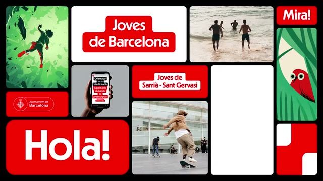
Joves de Barcelona 2024 brand identity by Principi
Joves de Barcelona logo

Joves de Barcelona

Open in new tab
The Linda Hall 2026 rebrand by Jekyll: brand identity reveal
The Linda Hall logo

The Linda Hall

Open in new tab
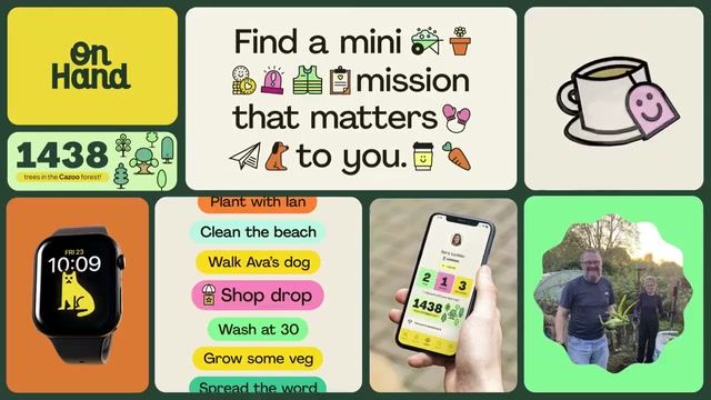
OnHand 2025 brand identity by Fiasco
OnHand logo

OnHand

More like this

  • More destinations brandingIndustry
  • More custom typefacesTypeface
  • More flat identitiesStyle
  • More vector art identitiesStyle
  • More illustration identitiesStyle
  • More condensed font identitiesStyle