Sign inGet Pro
IntrosBentosShotsMCPPricing
Sign inGet Pro
IntrosBentosShotsMCPPricing
Sign inGet Pro
IntrosBentosShotsMCPPricing

The curated reference library
for brand designers. Made by Sahkyo.

Rebrand on XRebrand on InstagramRebrand on ThreadsRebrand on LinkedIn

Company

About UsPricingMCP

Examples

Rebranding examplesBrand identity examples
Shots
Billboard & OOHPackagingBrand guidelinesSignageMerchEditorialStationery
Industries
FintechAIHospitalityFoodHealthcareSportsCulture
Styles
Geometric3DGradientPatternWordmark
Typography
Sans SerifSerifDisplayMono
Typefaces
ABC DiatypeRoobertRebond GrotesqueSuisse Int'lNeue Montreal
Feels
VibrantApproachableConfidentHumanWarm

© 2026 Rebrand. All rights reserved.

PrivacyTermsCopyright
Moscow Exchange logo

Moscow Exchange

Moscow Exchange Rebrand & Brand Identity

Plenum·Finance·2021

Moscow Exchange is a thirty-year-old Russian exchange whose business has grown to include retail investing, over-the-counter products and the Finuslugi marketplace. Plenum's 2021 rebrand puts MOEX Group in front as the parent of every business and builds the identity around a stepped red block, a slice of a growth chart that only goes up, which carries the MOEX name. People still saw it as just the stock exchange, with a tired look and a pile of sub-brands.

Case Study
Explore
Company
Website
Colors

Pro

Typography

Pro

Type
Styles

Pro

Style 1Style 2Style 3Style 4Style 5Style 6

See this brand's 2 colors, typography and 6 styles with Rebrand Pro.

Upgrade to unlock

Shots

Moscow Exchange Art Direction: Brand Photography with Shopping Bag, 2021 rebrand by Plenum
Brand Photography with Shopping Bag
Art Direction
Moscow Exchange Art Direction: 3D Extruded Text Blocks, 2021 rebrand by Plenum
3D Extruded Text Blocks
Art Direction
Moscow Exchange Art Direction: Brand Collateral Overview, 2021 rebrand by Plenum
Brand Collateral Overview
Art Direction
Moscow Exchange Partners & Subbrands: MOEX Group Sub-brands Overview, 2021 rebrand by Plenum
MOEX Group Sub-brands Overview
Partners & Subbrands

See all 14 shots with Rebrand Pro.

Upgrade to unlock

Moscow Exchange among investment companies

Pro

On the expressive, approachable sideTop third for approachability. Brand 25 is the most approachable
ExpressiveRestrainedPreciseApproachableMoscow ExchangeBrand 25Brand 6Brand 3Brand 18Brand 17Brand 5Brand 15Brand 29Brand 8Brand 28Brand 10Brand 7Brand 26Brand 13Brand 12
A rare lime hereIn 2 of 30 palettes here
2018’19’20’21’22’23’24’25
Two hues in one paletteMost others use one or two hues
Rare tags hereUnder 1 in 5 others have each
  • #Witty
  • #Characters
  • #Display
  • #Geometric
  • #Playful
Closest: Brand 11 and Brand 6Furthest palette: Brand 3
Brand 111 close colourBrand 61 close colour

See where Moscow Exchange sits among 7 investment companies with Rebrand Pro.

Upgrade to unlock

Similar vibe

Intros and bentos that look and feel like Moscow Exchange
Open in new tab
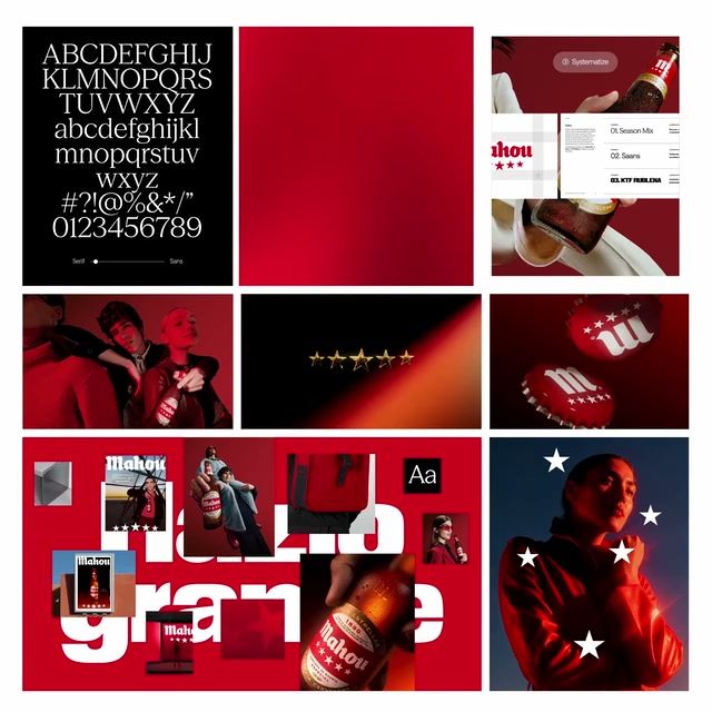
Mahou 2025 brand identity by Firma
Mahou logo

Mahou

Open in new tab
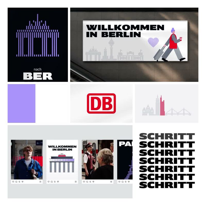
Deutsche Bahn 2026 brand identity by STRICHPUNKT DESIGN
Deutsche Bahn logo

Deutsche Bahn

Open in new tab
Munch 2020 rebrand by North: brand identity reveal
Munch logo

Munch

Open in new tab
Glamox 2021 rebrand by Knowit: brand identity reveal
Glamox logo

Glamox

More like this

  • More fintech brandingIndustry
  • More geometric identitiesStyle
  • More flat identitiesStyle
  • More uppercase identitiesStyle
  • More high-contrast identitiesStyle
  • More monochromatic identitiesStyle
  • More photography identitiesStyle
Moscow Exchange 2021 rebrand by Plenum: brand identity reveal
0:00 / 0:46· Logo