
Sign inGet Pro
IntrosBentosShotsMCPPricing
Sign inGet Pro
IntrosBentosShotsMCPPricing
Sign inGet Pro
IntrosBentosShotsMCPPricing

The curated reference library
for brand designers. Made by Sahkyo.

Rebrand on XRebrand on InstagramRebrand on ThreadsRebrand on LinkedIn

Company

About UsPricingMCP

Examples

Rebranding examplesBrand identity examples
Shots
Billboard & OOHPackagingBrand guidelinesSignageMerchEditorialStationery
Industries
FintechAIHospitalityFoodHealthcareSportsCulture
Styles
Geometric3DGradientPatternWordmark
Typography
Sans SerifSerifDisplayMono
Typefaces
ABC DiatypeRoobertRebond GrotesqueSuisse Int'lNeue Montreal
Feels
VibrantApproachableConfidentHumanWarm

© 2026 Rebrand. All rights reserved.

PrivacyTermsCopyright
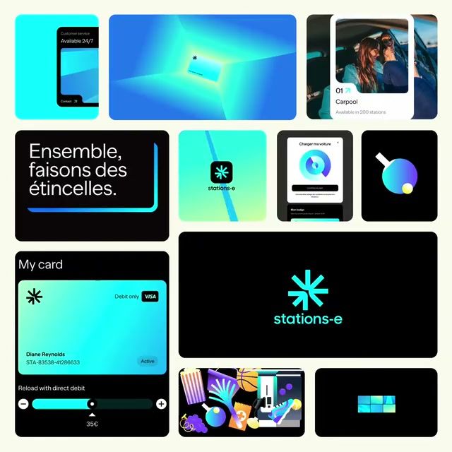
Stations-e 2024 brand identity by Call Me Lord
Stations-e logo

Stations-e

Stations-e Brand Identity

Call Me Lord·Service·2024

Stations-e runs electric car charging stations it calls the most cost-effective in Europe, hosting services such as parcel pickup, broadband and music streaming whose rent lowers energy prices. Going green usually comes at a steep price, and the company asks whether truly sustainable driving lies in collective strength and creativity. Call Me Lord gave it a more unified brand ahead of its European expansion, capturing what happens when money, communities and service providers pull together.

Case Study
Explore
Company
Website
Colors

Pro

Typography

Pro

Type
Styles

Pro

Style 1Style 2Style 3Style 4Style 5Style 6Style 7Style 8

See this brand's 5 colors, typography and 8 styles with Rebrand Pro.

Upgrade to unlock

Shots

Stations-e Logo Construction: Logo, brand identity by Call Me Lord
Logo
Logo Construction
Stations-e Art Direction: Portrait, brand identity by Call Me Lord
Portrait
Art Direction
Stations-e Motion: App modules, brand identity by Call Me Lord
App modules
Motion
Stations-e Motion: Service cards, brand identity by Call Me Lord
Service cards
Motion

See all 22 shots with Rebrand Pro.

Upgrade to unlock

Stations-e among energy companies

Pro

On the expressive, approachable sideTop third for approachability. Brand 25 is the most approachable
ExpressiveRestrainedPreciseApproachableStations-eBrand 25Brand 6Brand 3Brand 18Brand 17Brand 5Brand 15Brand 29Brand 8Brand 28Brand 10Brand 7Brand 26Brand 13Brand 12
A rare lime hereIn 2 of 30 palettes here
2018’19’20’21’22’23’24’25
Two hues in one paletteMost others use one or two hues
Rare tags hereUnder 1 in 5 others have each
  • #Witty
  • #Characters
  • #Display
  • #Geometric
  • #Playful
Closest: Brand 11 and Brand 6Furthest palette: Brand 3
Brand 111 close colourBrand 61 close colour

See where Stations-e sits among 12 energy companies with Rebrand Pro.

Upgrade to unlock

Similar vibe

Intros and bentos that look and feel like Stations-e

Open in new tab
Eurostar 2023 rebrand by DesignStudio: brand identity reveal
Eurostar logo

Eurostar

Open in new tab
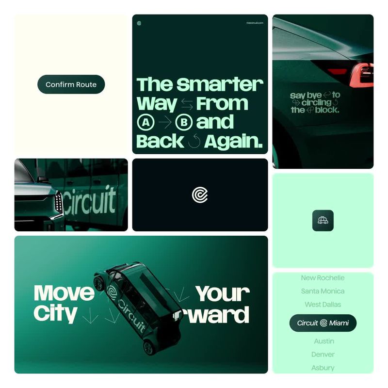
Circuit 2026 brand identity by The Collected Works
Circuit logo

Circuit

Open in new tab
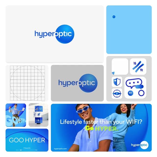
Hyperoptic 2023 brand identity by Monroe
Hyperoptic logo

Hyperoptic

Open in new tab
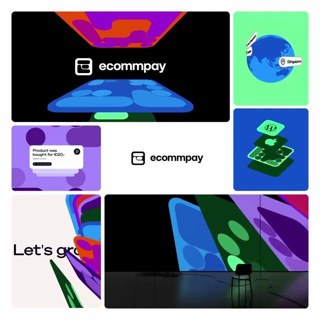
Ecommpay 2024 brand identity by Verve
Ecommpay logo

Ecommpay

More like this

  • More service brandingIndustry
  • More by Call Me LordStudio
  • More icon set identitiesStyle
  • More mask identitiesStyle
  • More 3D identitiesStyle
  • More gradient identitiesStyle
  • More flat identitiesStyle
  • More UI identitiesStyle
  • More vector art identitiesStyle
  • More photography identitiesStyle