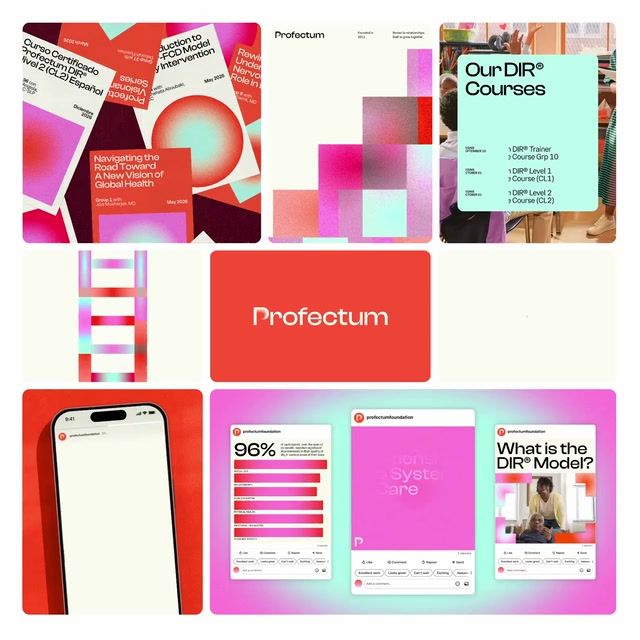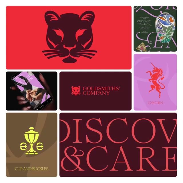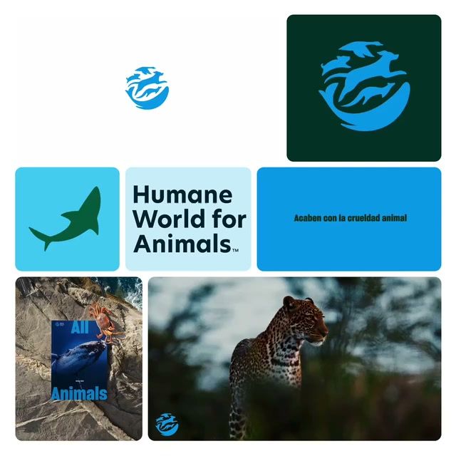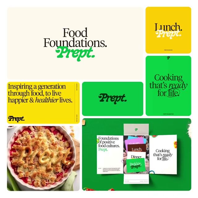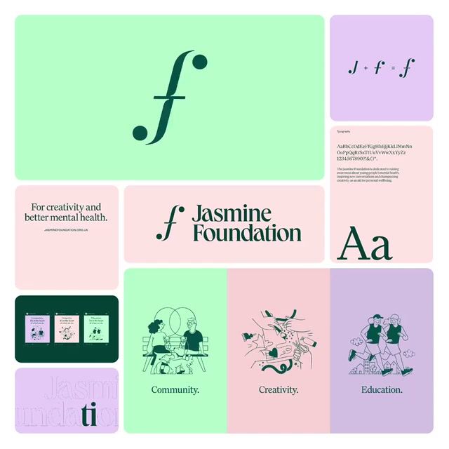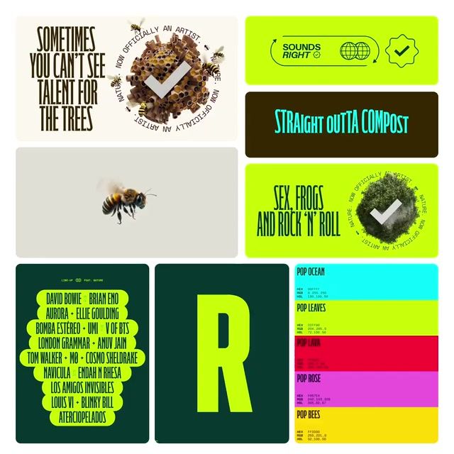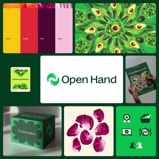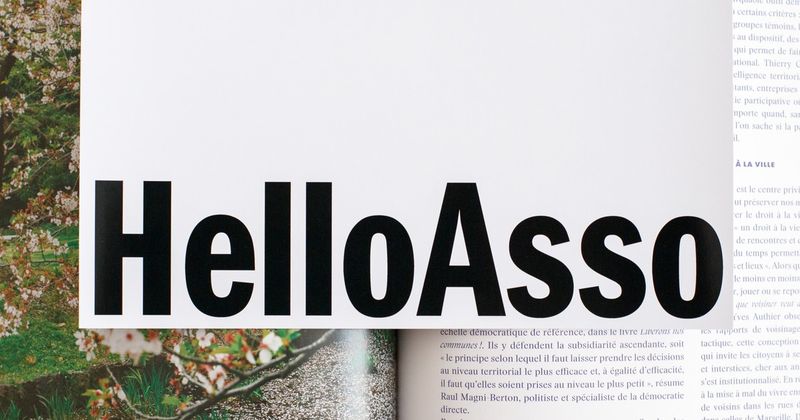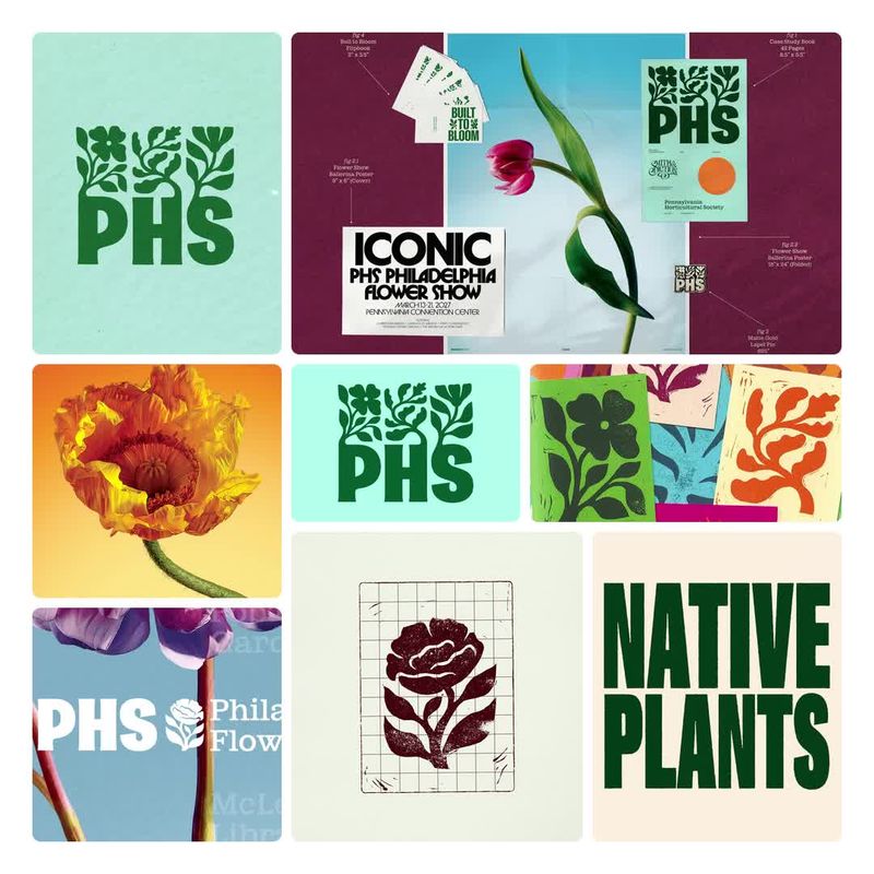

Every non profit identity in the gallery — logos, systems, and the work around them, browsable by style and studio.
Pro
Non profits default to forest and green palettes, sans serif type and a human, approachable tone, with photography in most work. Greys and light neutrals are rare here, so a brand that leads with a light neutral base and a dynamic layout would stand apart from the default.
Get the full snapshot for any search with Rebrand Pro.
Upgrade to unlock