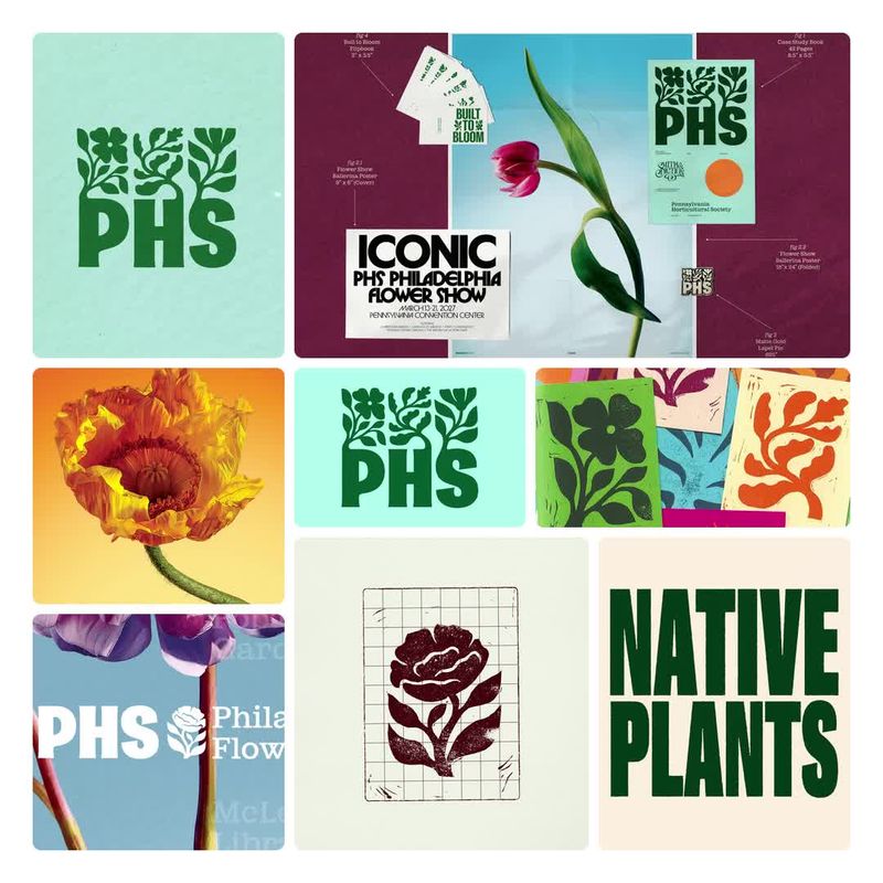

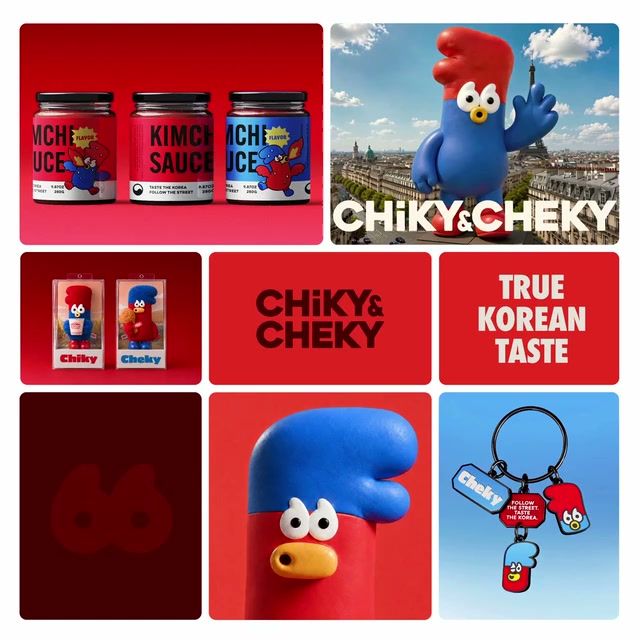
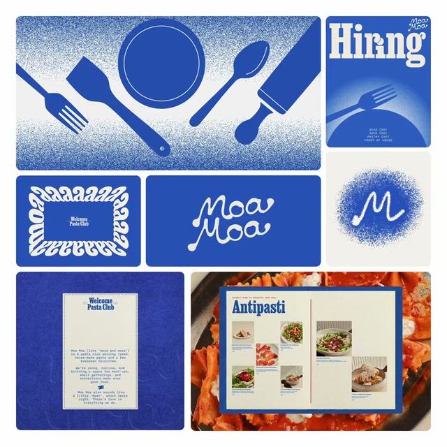
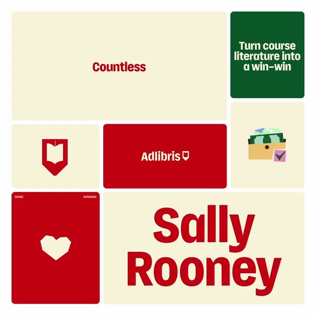
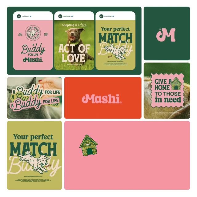
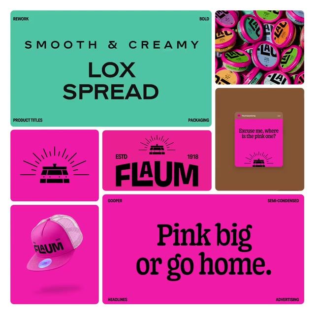
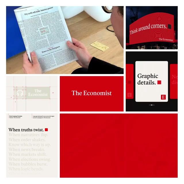
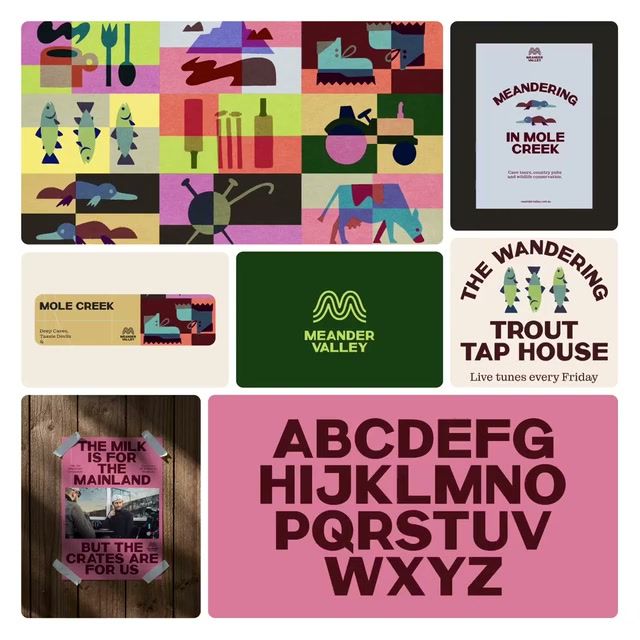
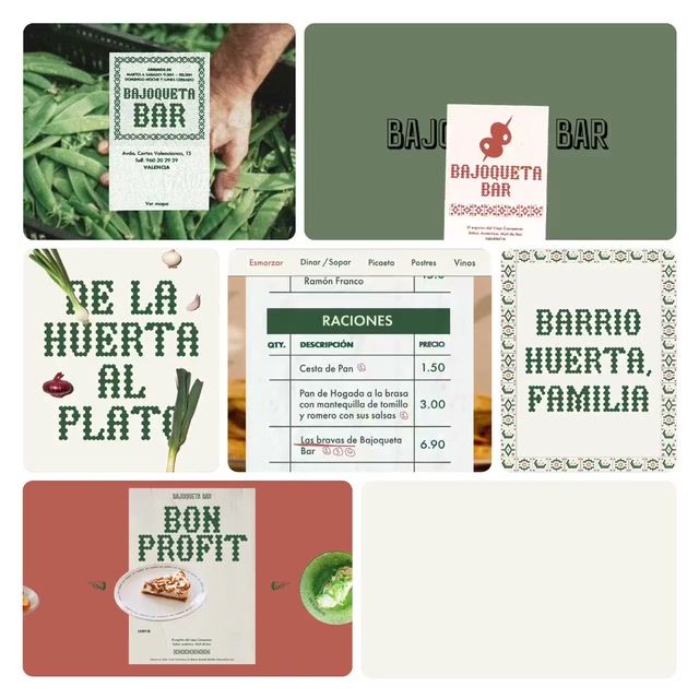
Every identity on Rebrand that leans on slab serif type — browsable by industry, style, and studio.
Pro
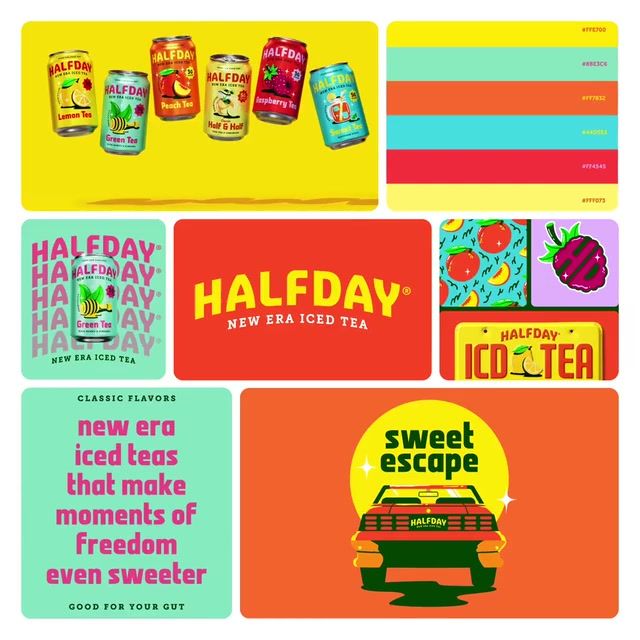
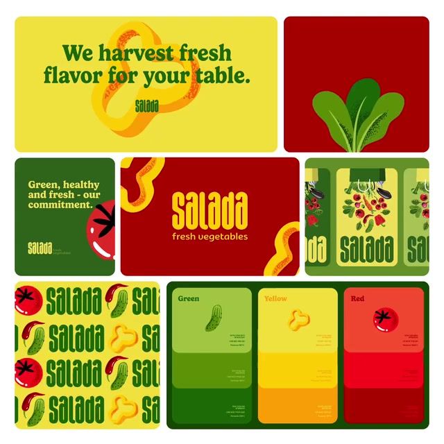
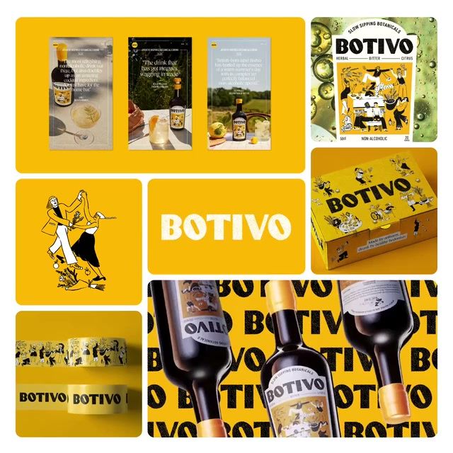
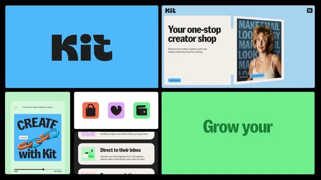
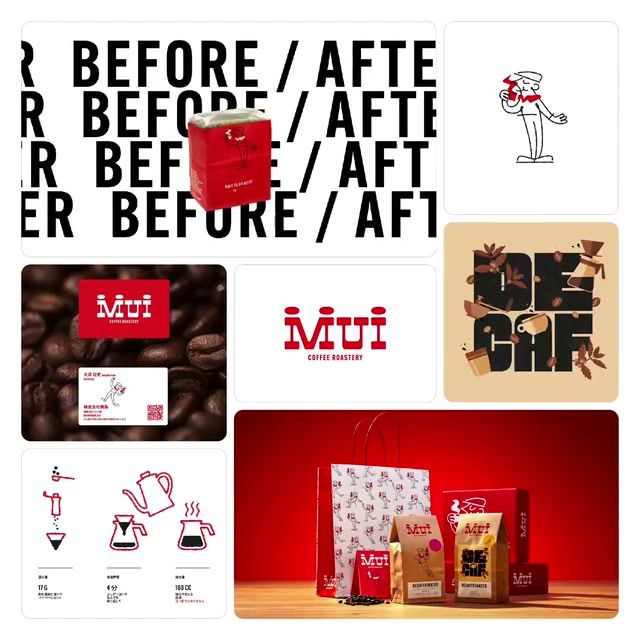
Slab serif typography defaults to yellow and red, with warm, playful and illustrated work around it. Serif and geometric directions are rare here, so a brand built on a geometric or serif-led look would stand apart. Newer brands are moving toward blues and teals and a more human, nostalgic feel, away from playful and warm.
Get the full snapshot for any search with Rebrand Pro.
Upgrade to unlock

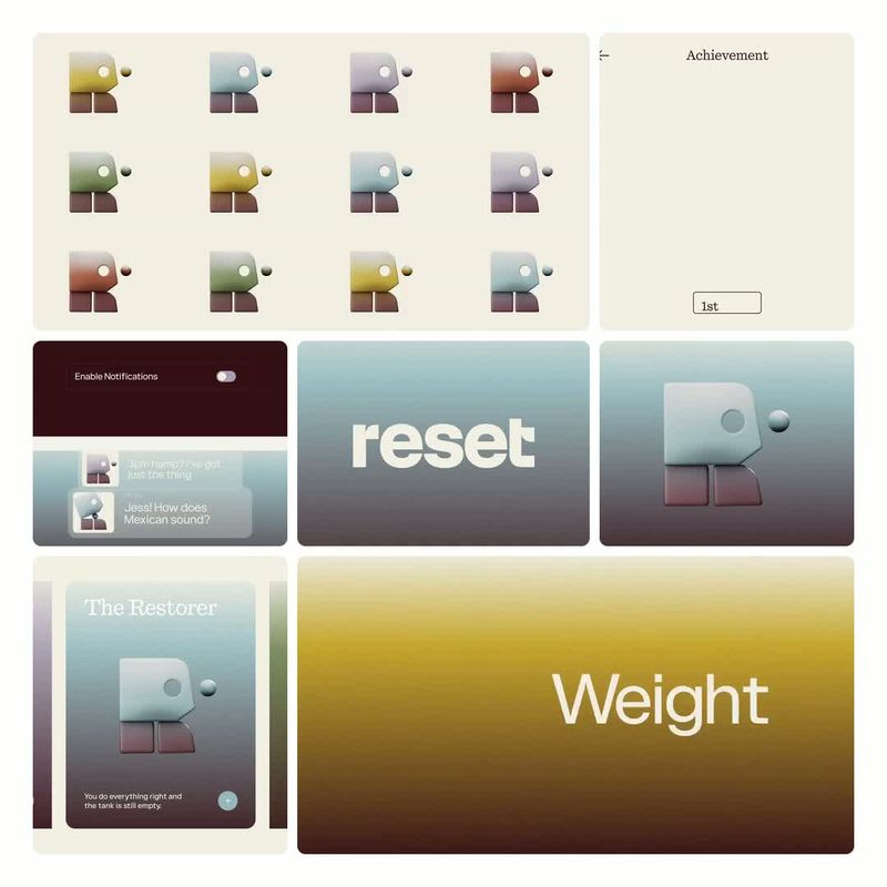

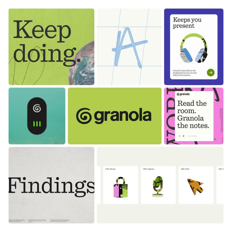

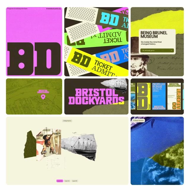


















Search and filter the library for free. Join 40,000 designers already inside.