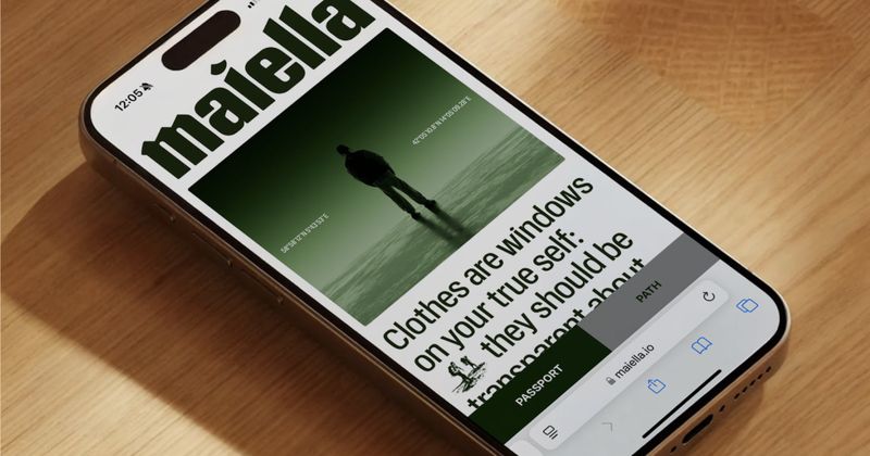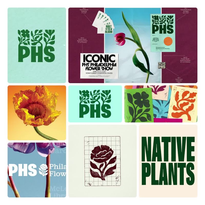

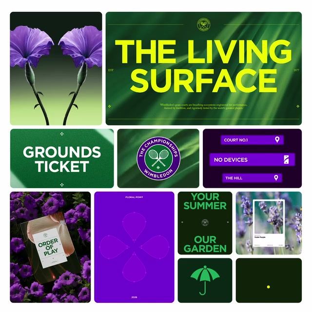
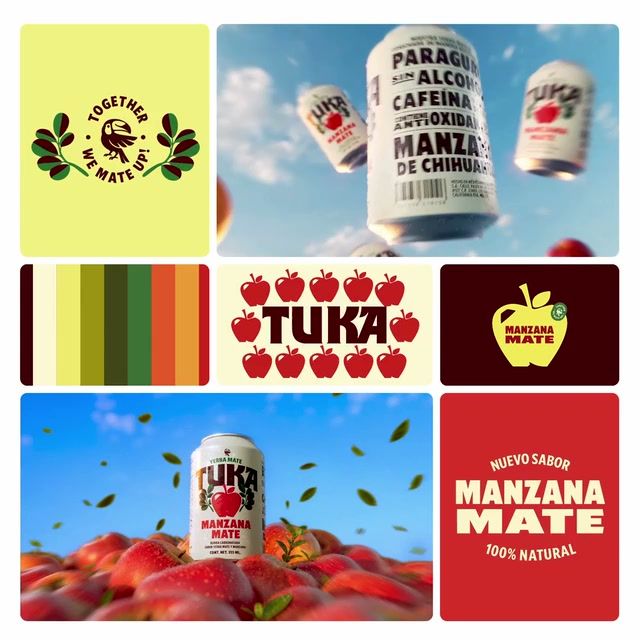
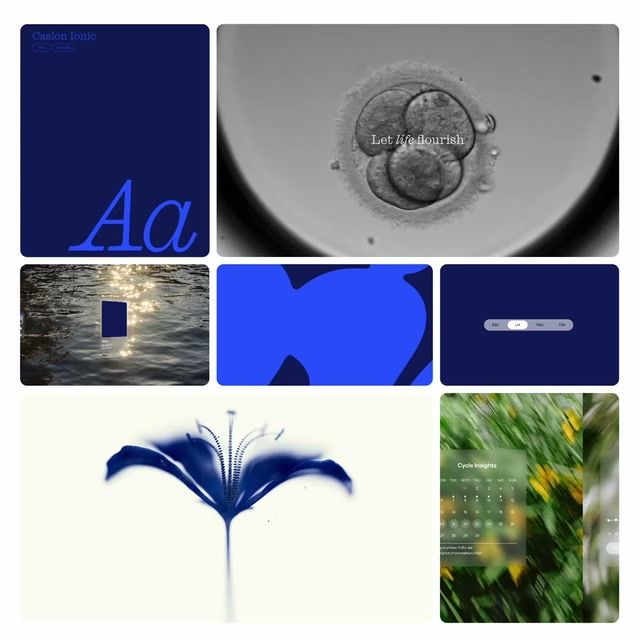
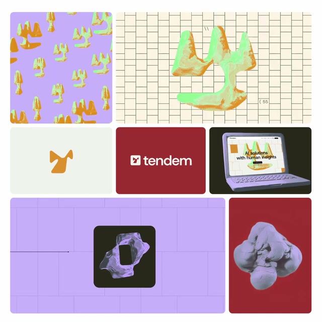
Identities that feel organic — browsable by industry, style, and studio.
Pro
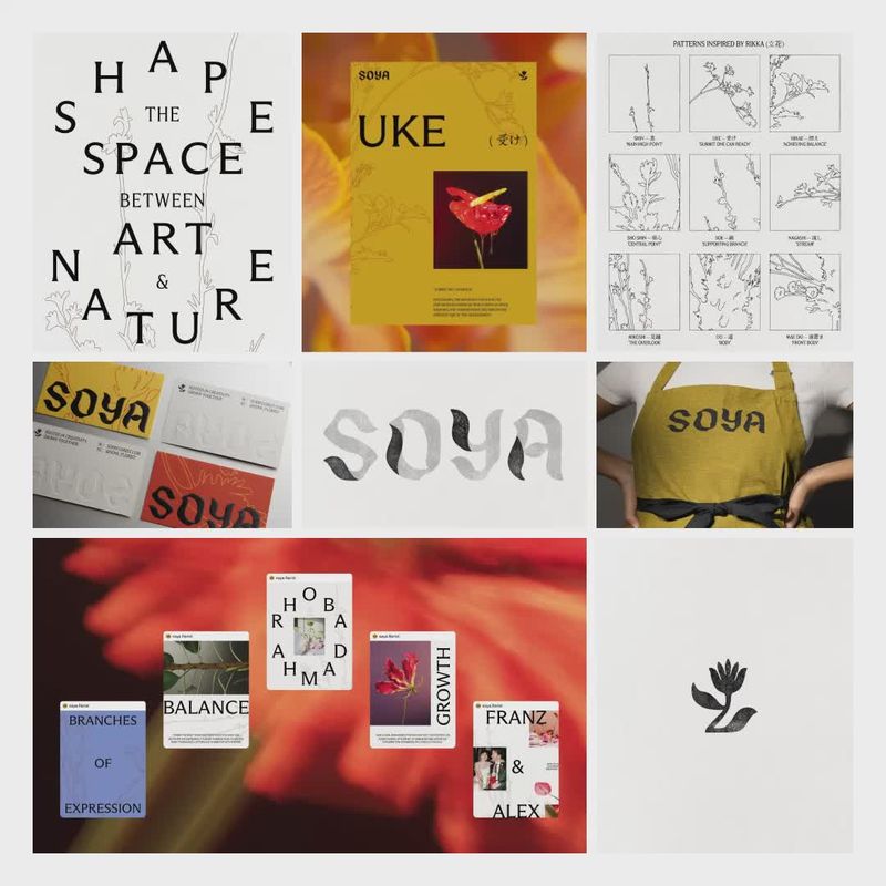
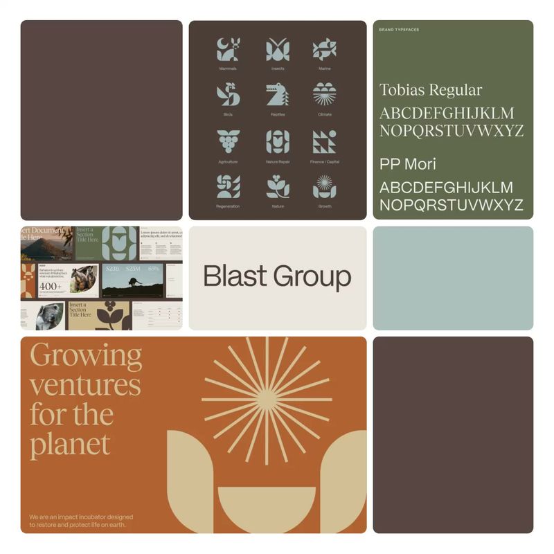
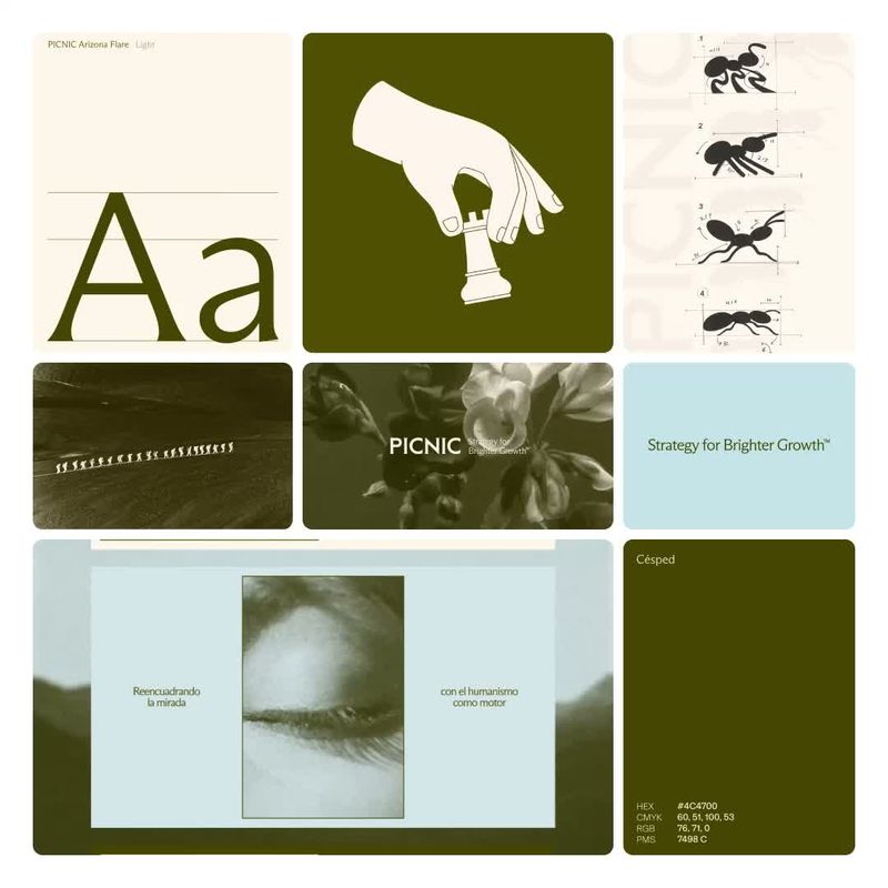
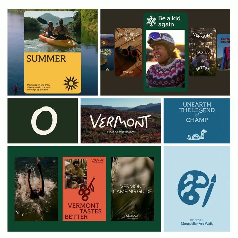
Organic brands default to forest and cream, sans serif type and photography, with a warm, grounded tone. Bold, confident and geometric work is nearly absent here, so a brand that pairs a strong geometric sans with a confident voice would stand apart. Newer brands are moving toward light neutrals and wordmarks, away from warm tones, illustration and colour.
Get the full snapshot for any search with Rebrand Pro.
Upgrade to unlock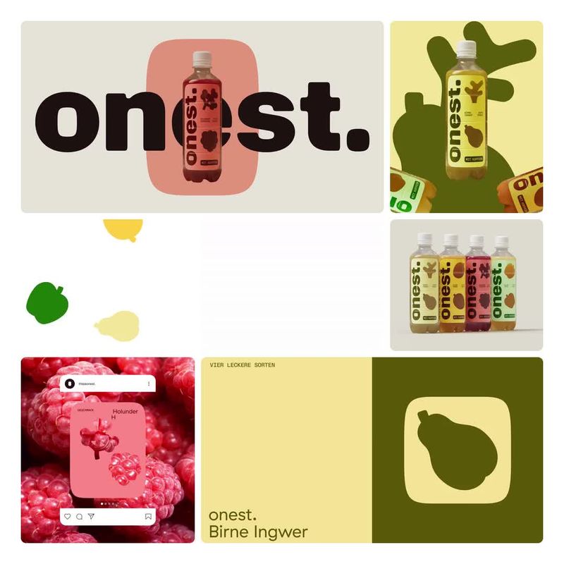



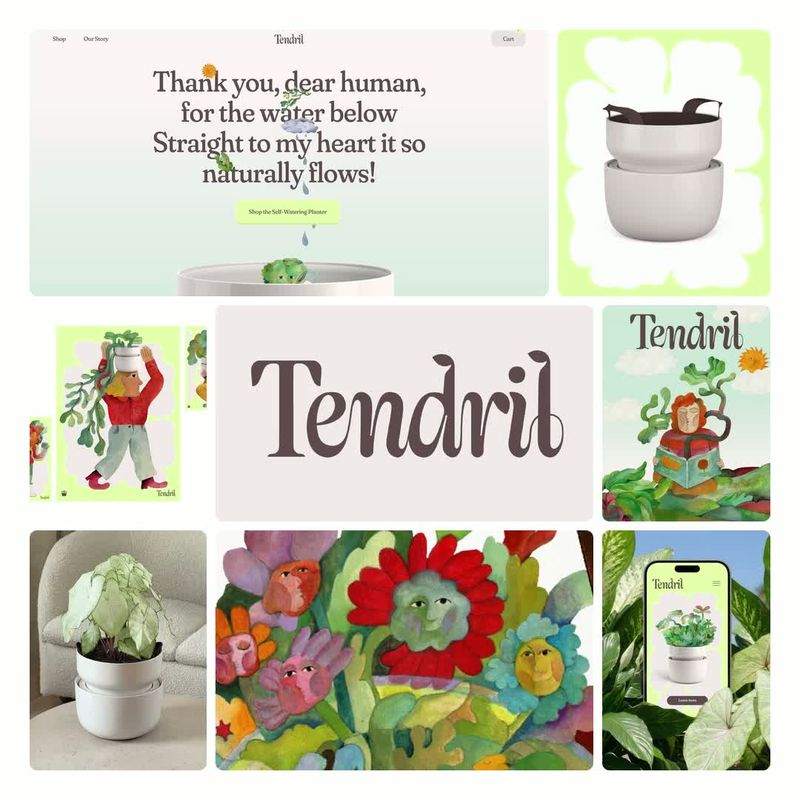

















Search and filter the library for free. Join 40,000 designers already inside.